Essays / Exhibition news / Publications

Bums on Seats Part IV

This week is all about colour. Yes I know, colour theory has been done to death but I feel that it’s important to consider it- especially following my recent works “First Past the Post” and “Straight from the Horse’s Ass”. I would also say that because I haven’t worked on a painting for a while (in the traditional sense) it serves as a reminder to not make any schoolboy errors. Experimentation is all well and good but the wrong choices will confuse everything. Or will they?

Up to this point the work has been mainly talking about the progression of time and the obsessive nature of your own online presence. So how do these abstract concepts relate to a colour scheme?

In truth it’s all down to interpretation; would I consider a month with crap viewing figures as being a cold colour? Or alternatively, would a green or a blue indicate a calmer feeling of, “oh well last month went alright so I don’t need to worry about it...”? On the flip side, warmer colours mean something different but essentially carry the same set of  contradictions. It’s a bugger alright.

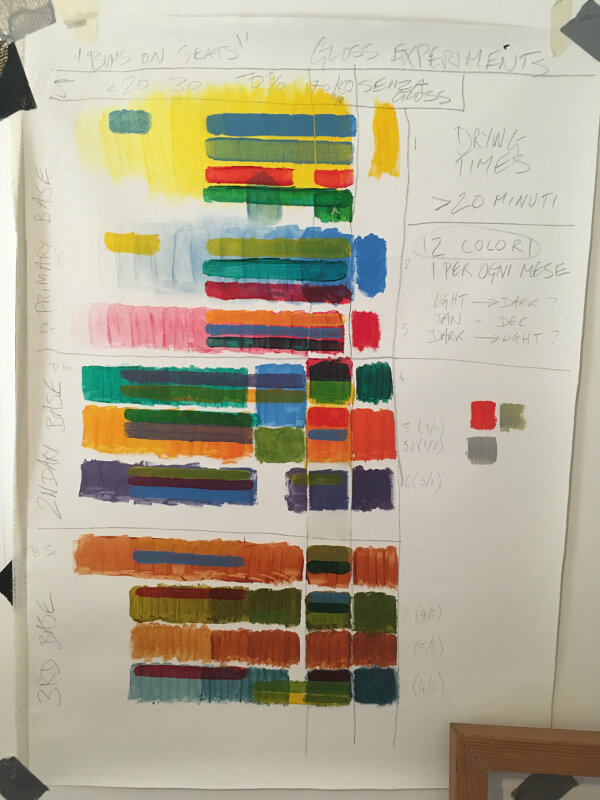
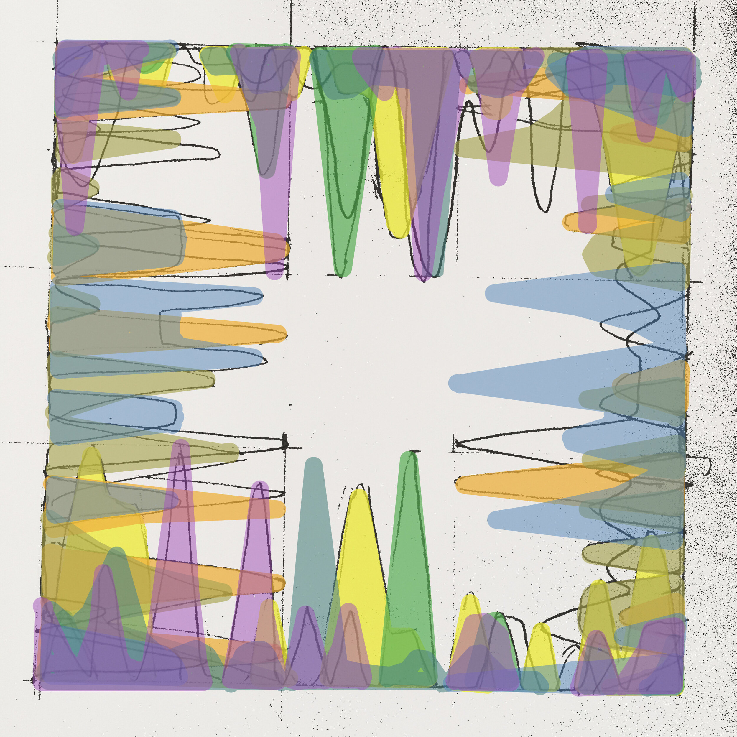
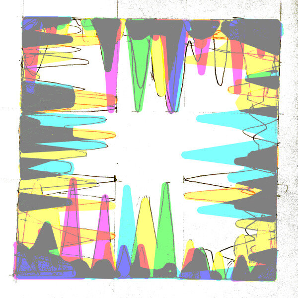
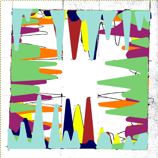
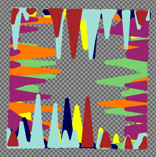
Christ, don’t trip over your laces on the starting line, it’s only colour, they’ll fade over time anyway- which does in fact lead me into the next point. I mentioned the passage of time earlier and this work (which will account for a year’s worth of analytics) represents how something as trivial as a statistic is all consuming but is then quickly overtaken by the latest data set. In the gallery below are some of the tests that I have been doing, beginning on canvas. In the later versions, even though the simple progression around the colour wheel can be digitally altered to any preference, it’s interesting how complimentary colours cancel each other out even in a computerised simulation.      

The acrylic tests include some experiments with opacity using a gloss medium as a thinner. I would say that I’m unsure about which is the best ratio but in any case it felt like I was painting with dead expensive shampoo or conditioner- not ideal! However, translucency is something I should explore further as it gives the image more depth and would make a change from the block colours of the previous works.

Next week: preparing canvas ……..YAWN…… but seeing as I’m writing about everything…
Straight from the horse's ass (part 2)

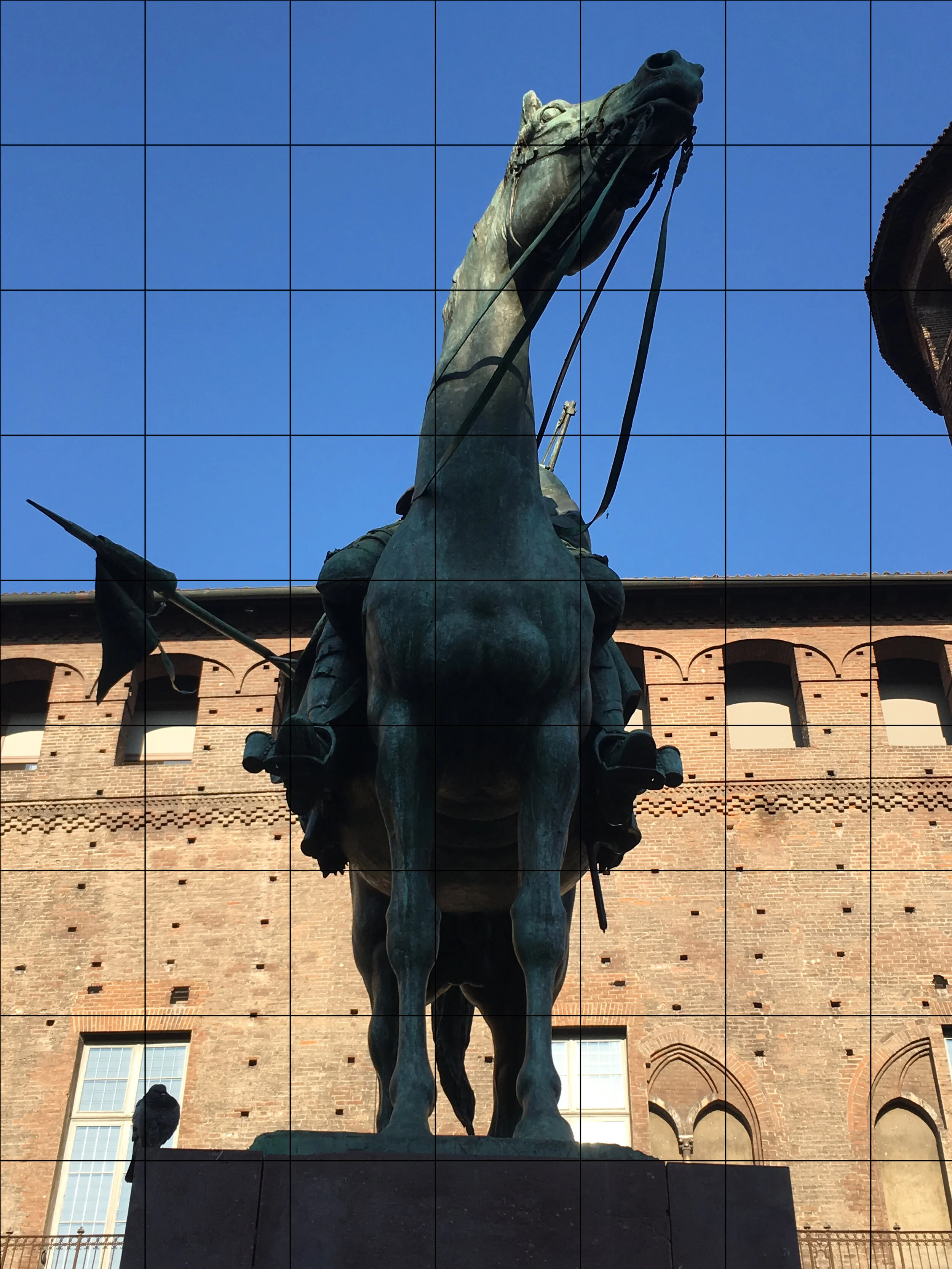
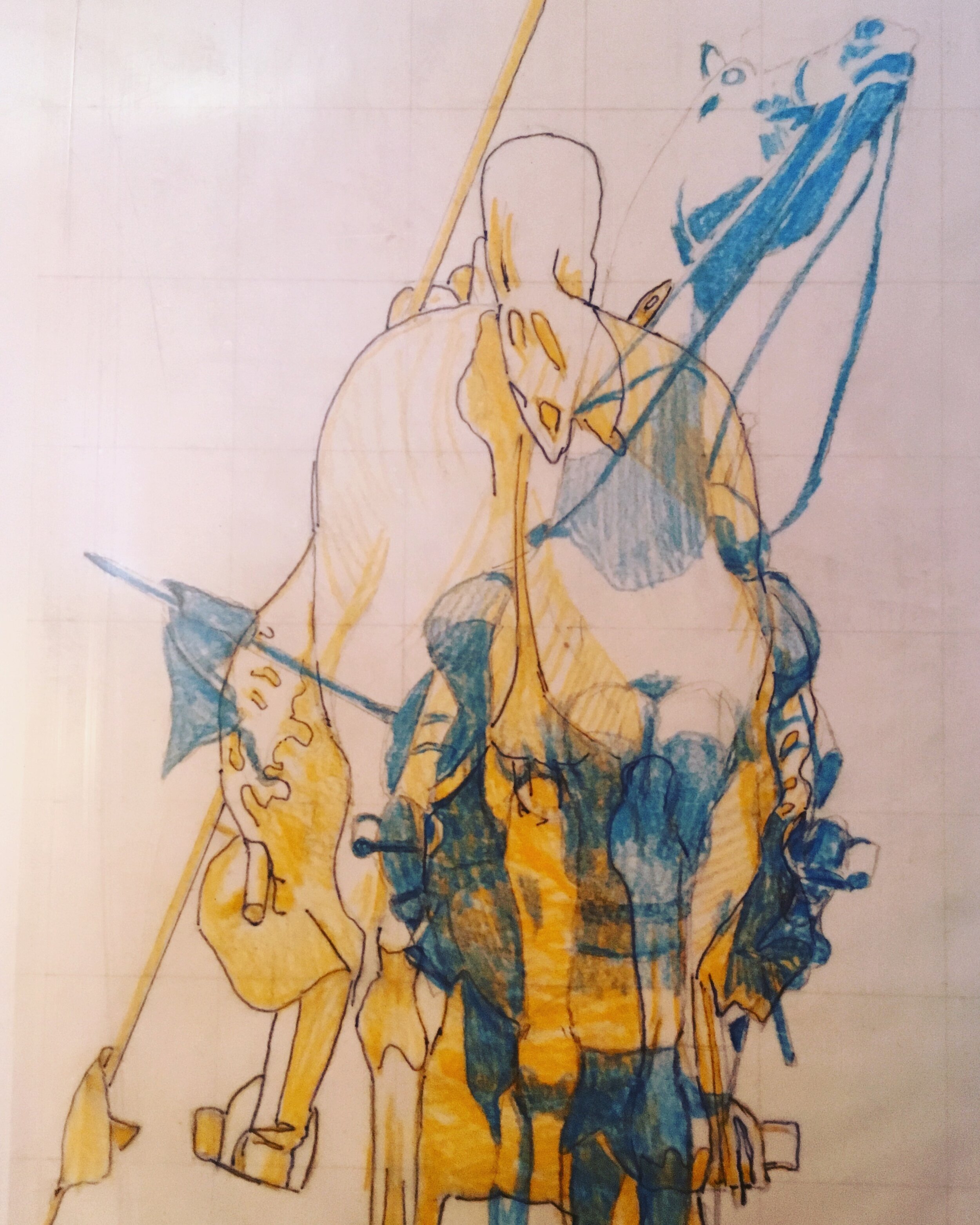
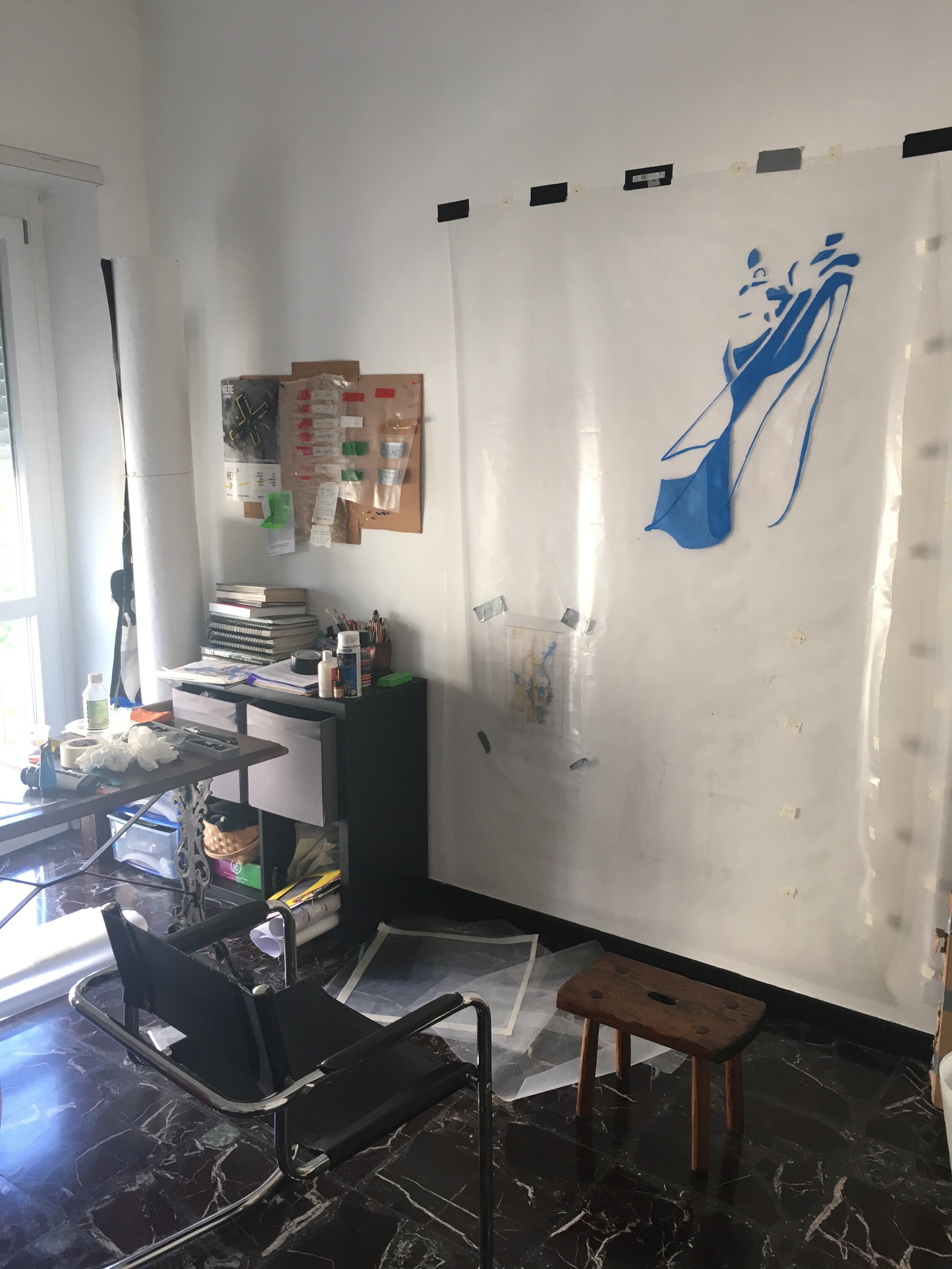
The concept took prescedence last week in part one, so I thought part two should contain some more technical details on the work but include some more insight as to how it is being made and why. The photos in the gallery (click to enlarge) are of the first piece in a series of five. They show the progression from the initial photograph to colour study and then full scale.

Speaking of scale, I found it essential to get as close as possible to a 1:1 (from the view at street level at least) to convey the uniformity that the chosen subjects have in the real world. Seeing as the concept is based on power, I found the decision to replicate and repeat entirely fitting.

The material is polythene, each of the five sheets measuring 2100x1500 mm. As painting on plastic is damn near impossible I had to experiment and produced a formula which I cannot disclose for obvious reasons.

When it came to the colour scheme (as you can also see in part one) the work relies heavily on the complimentary scale to represent duality. Contrasting colours such as blue and yellow speak of a number of different things, high on the list being political parties, moods or even personal preferences. However, the very nature of a clash, presented on two sides of the same object emphasises what people in power are inevitably conflicted by; that human nature often derails a principle.

The composition of each piece (as aforementioned) is based around the front and back of each monument. Due to the subsequent narrowness, each side makes an abstraction of the other (see part one for a better example) and the combinations sometimes give no real clarity on what you’re actually looking at. The blank areas on one side render the base layer of the other entirely visible and create an interesting dilemma on where to shift your vision.

In light of recent events in the UK; once the last part of this work is underway, the further political context of the work will be explored next week.

Paratissima venue and designs

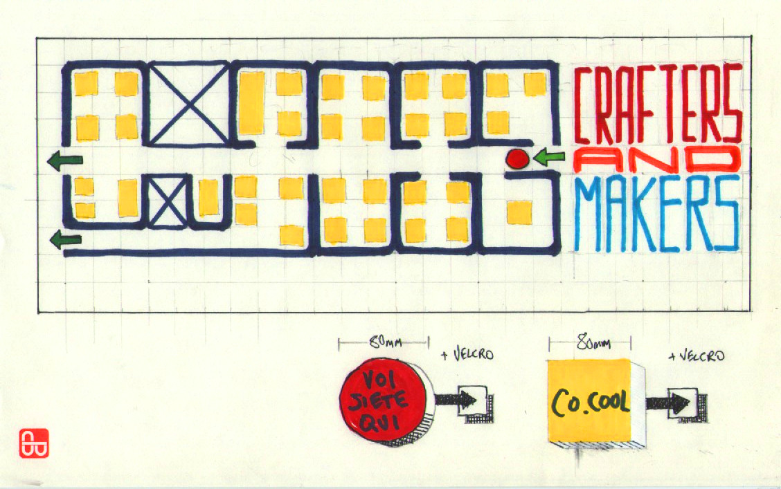
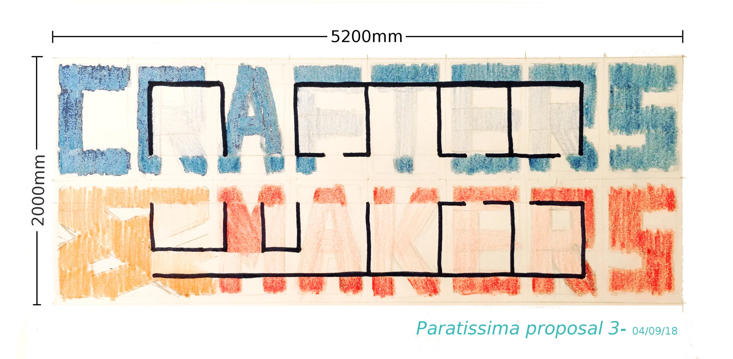
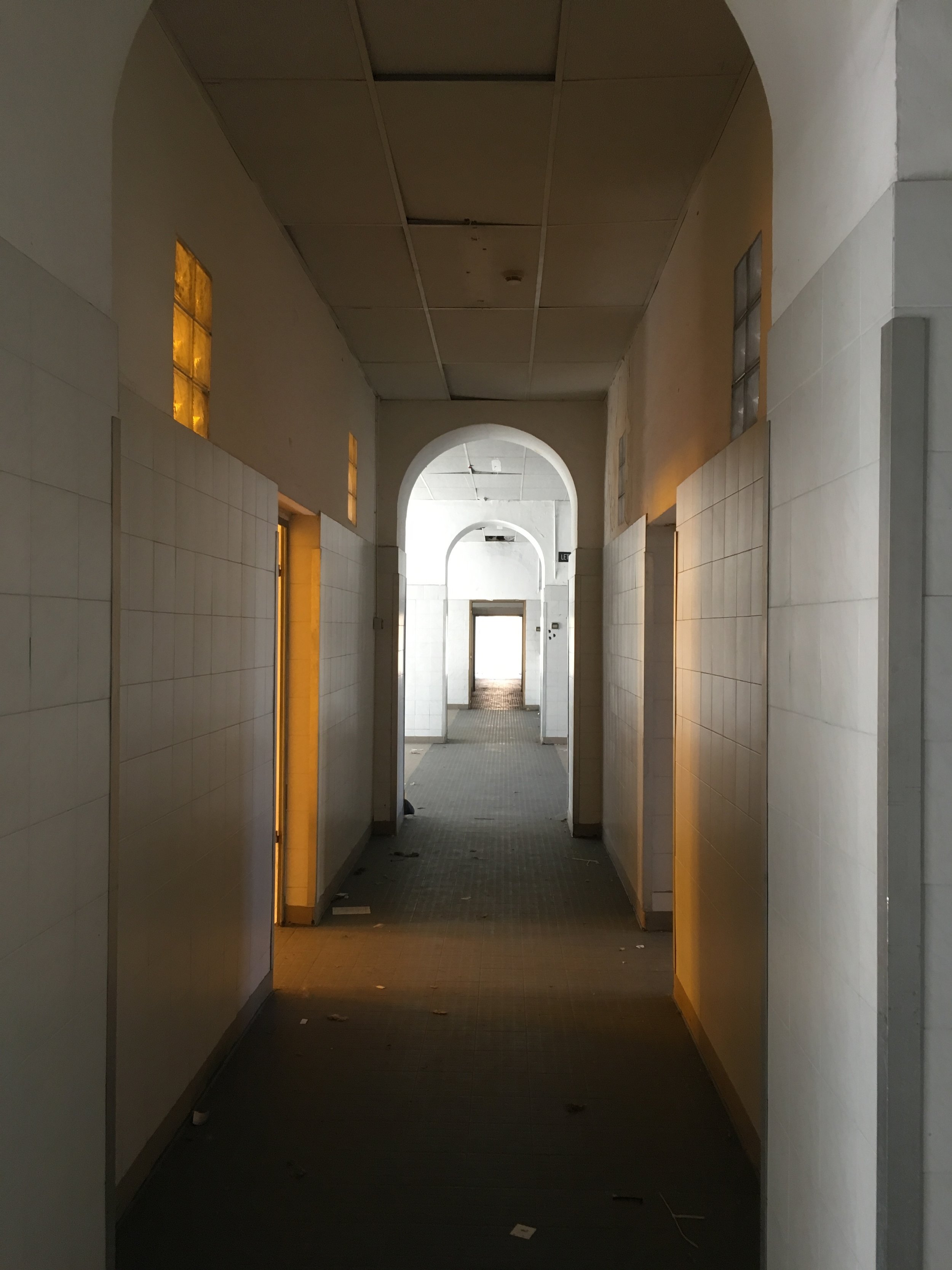
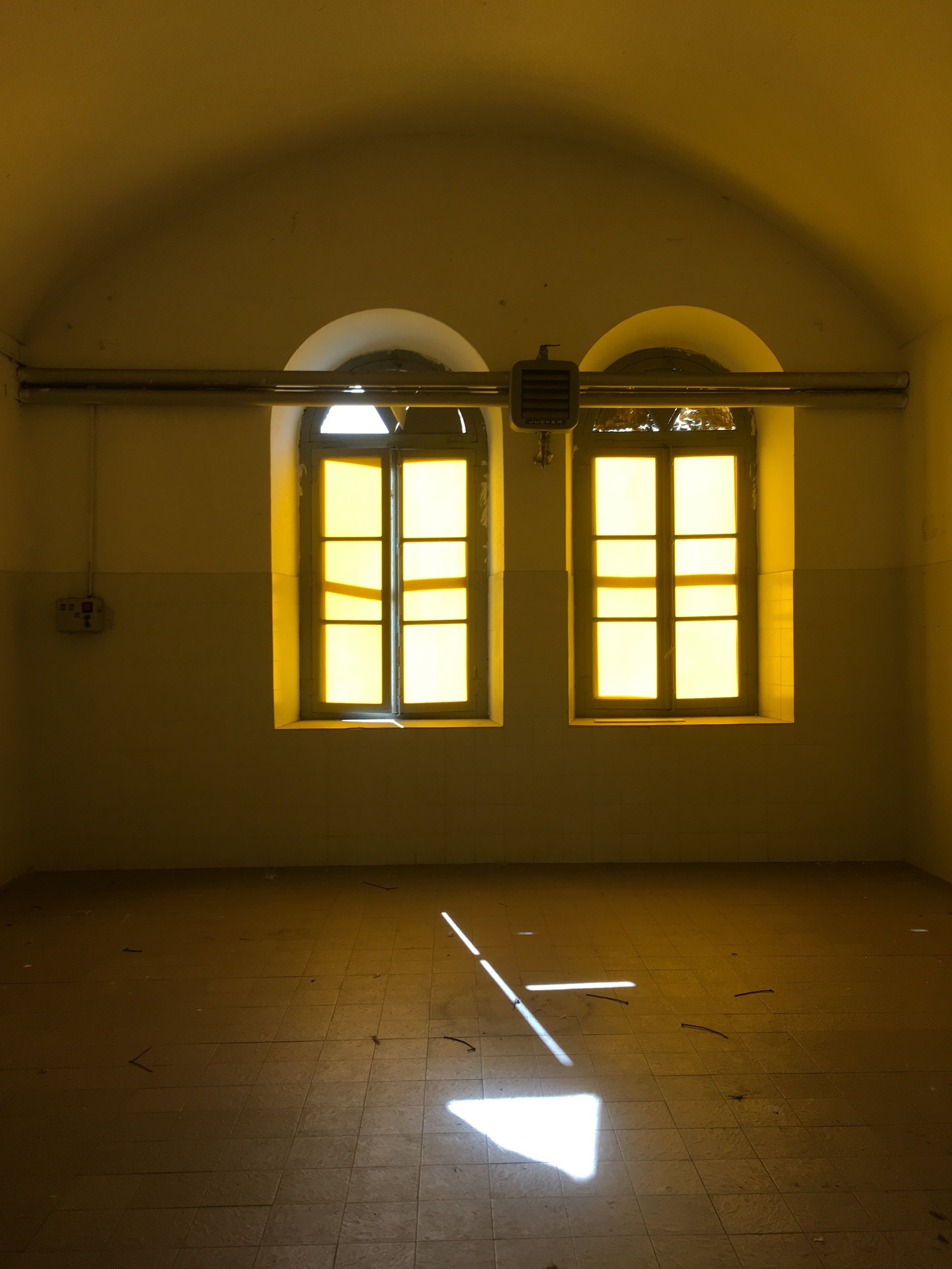
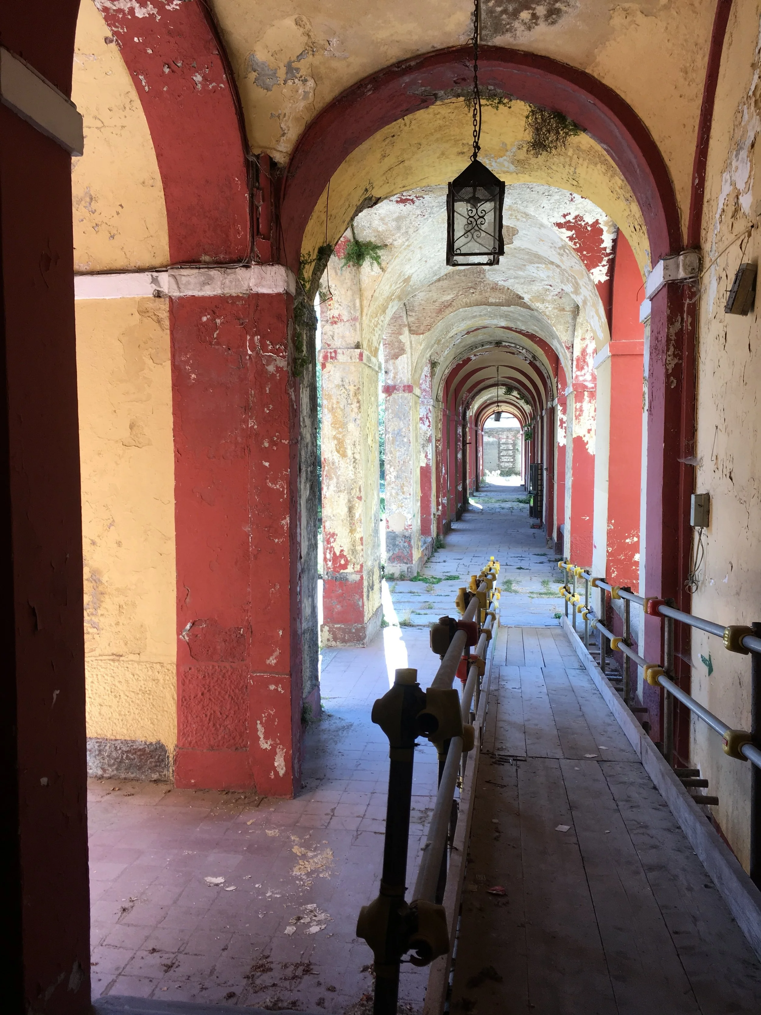
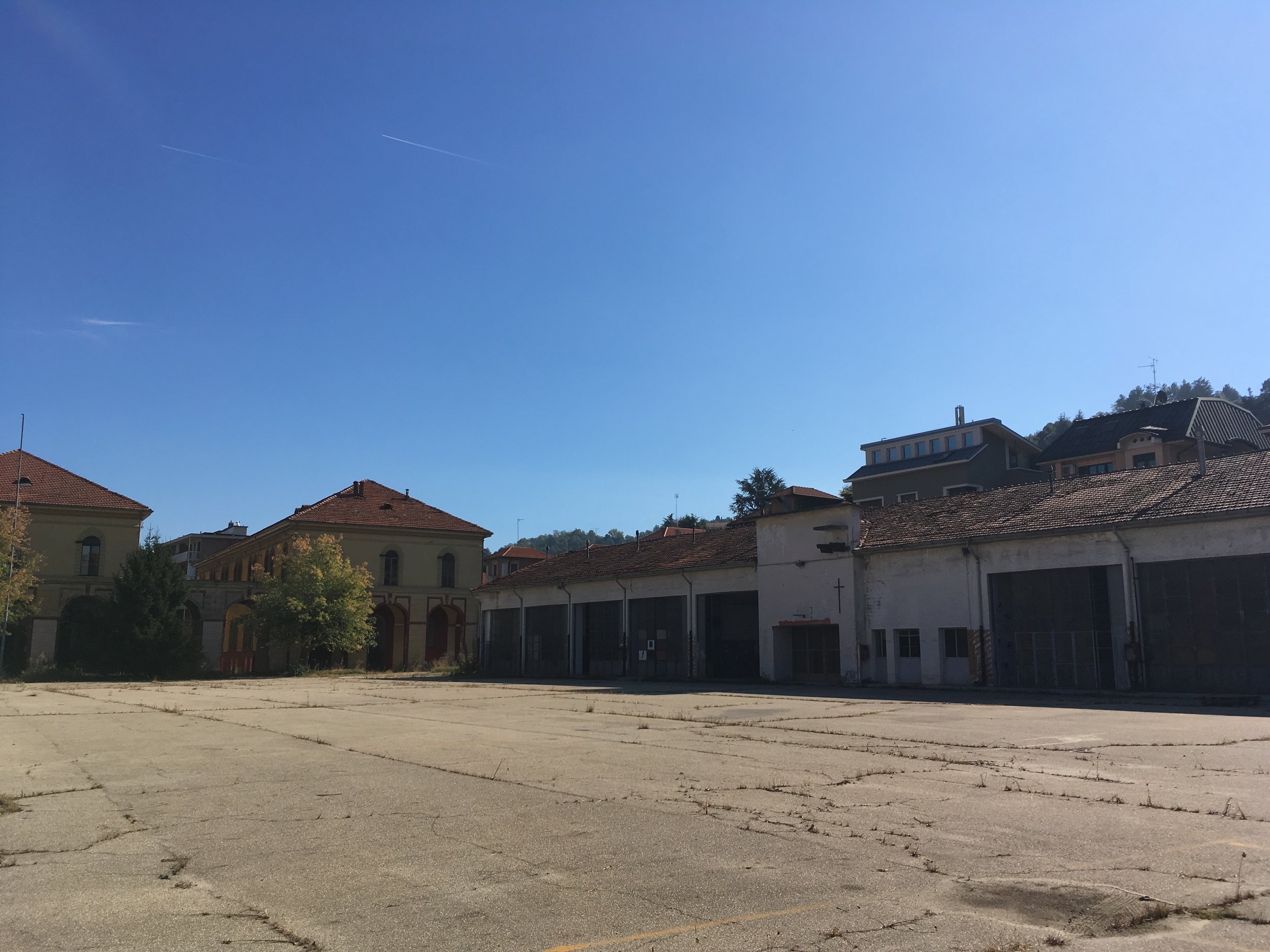
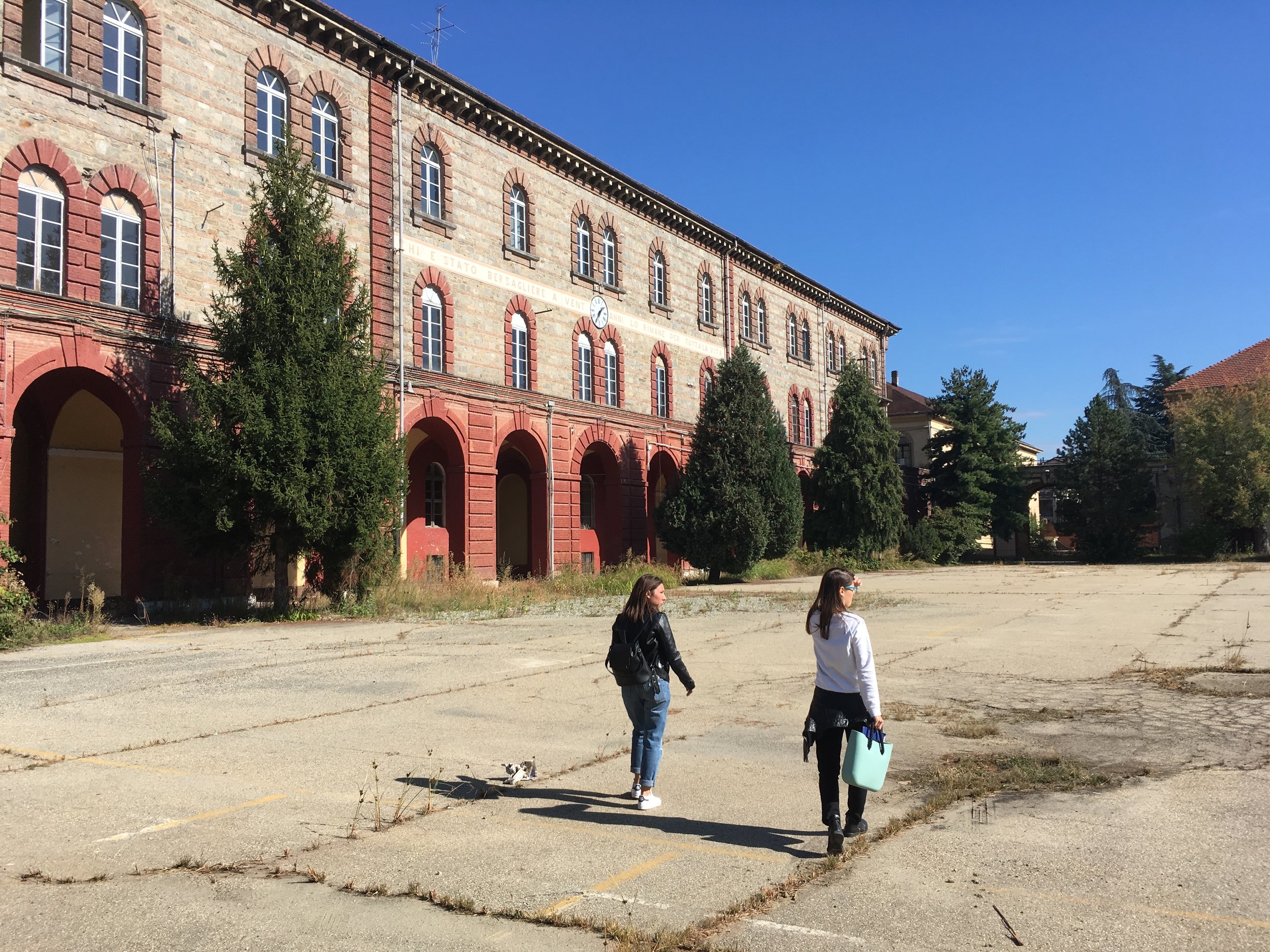
This years Paratissima “Feeling Different” opens on October 31st, Caserma Alessandro La Marmora, Via Asti, Torino. I’m working on this one as part of the install team. Here are some pre-build interior shots and some working signage drawings. I will be in at the Crafters and Makers section until November 5th. Come on down

http://paratissima.it/paratissima-14-feeling-different/