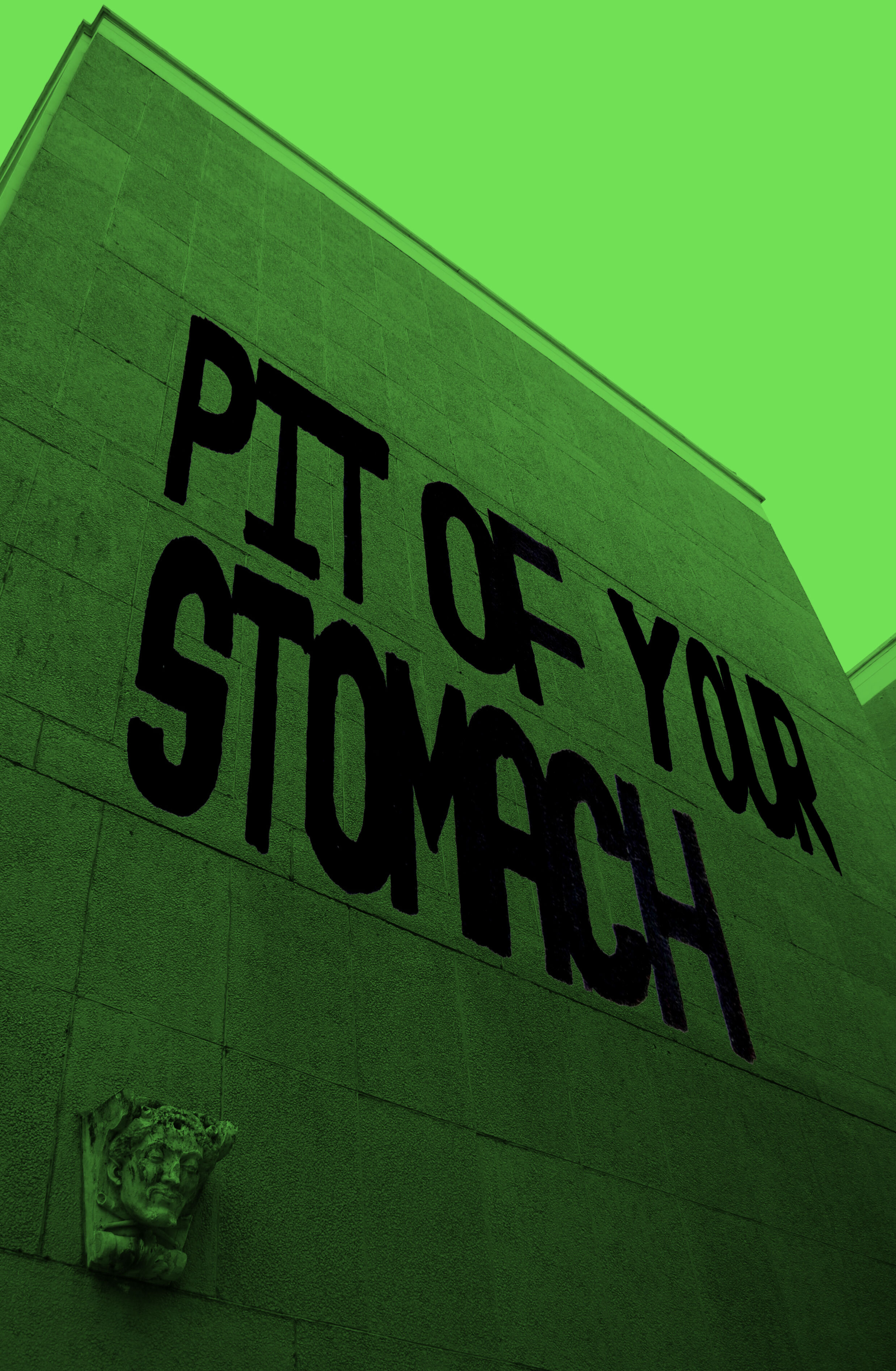
No title
550 x 250 mm
Vinyl on polythene
Torino 2020
January 2nd brought the sad news that John Baldessari died at home in California aged 88. I have always considered him a huge influence, not just in terms of his varied subject matter and visual presentation but also of how he thought about art.
For the most part Baldessari’s work always carries a sense of humour which quickly eradicates any sense of pretension. You only have to look at works such as “The Pencil Story” (1972) to see this in action; also, in this instance, the very fact that the idea is written out instantly reveals the concept in a very succinct manner. (see source link below)
Furthermore, it is obvious to note that any other visual parts deemed unnecessary are deliberately avoided. Certainly an interesting decision on the grounds of how something is made; staying honest to the idea is often difficult, especially if time elapses between conception and final work.
The sensibility of Baldessari’s work (especially during the late 60s-early 70’s) goes beyond the conceptual angle into the realms of graphics and advertising. I see the similarities stemming from how publicity picks up on details, quirks and things that break up the rhythm of everyday life in order to garner attention. Is there any huge difference between concept art and advertising in that they are both subliminal? You could argue this case for any artwork but it seems more evident in works such as Baldessari’s.
…
On to the tribute work. The question of originality came up whilst I was producing The Coincidences Project some time ago; one offshoot from this (that was never fully explored) was how artworks may appear the same even if produced by two different people in two different places.
This line of inquiry was ripe for a ‘Baldessarian’ take, so introducing text back into the work was vital. The as yet untitled piece introduces the term ‘Coincidentalist’ as a joke on the many ‘ists’ and ‘isms’ that the art world uses to classify thought. In order to strengthen the message, I decided to minimalise the work to such a degree that even the base for the vinyl lettering (MasterType Roslyn) is transparent.
Has, in fact, another artist made this before I did and for the same reasons? It is definitely odd when you do stumble across something which asks the same questions or at the very least looks similar. There has always been a debate about originality in art and how artists try to ‘own’ their own style but what does it matter if you’re oblivious.
RIP John Baldessari 1931-2020


