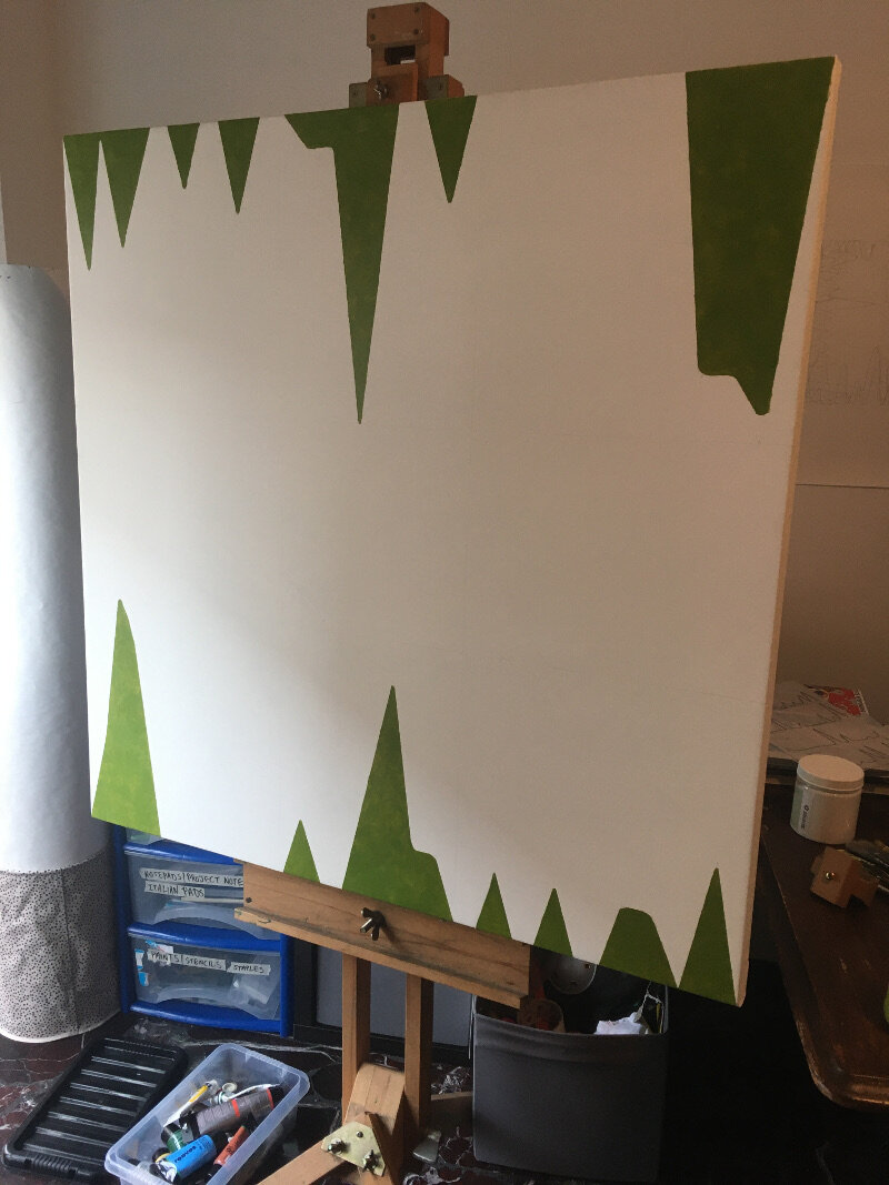
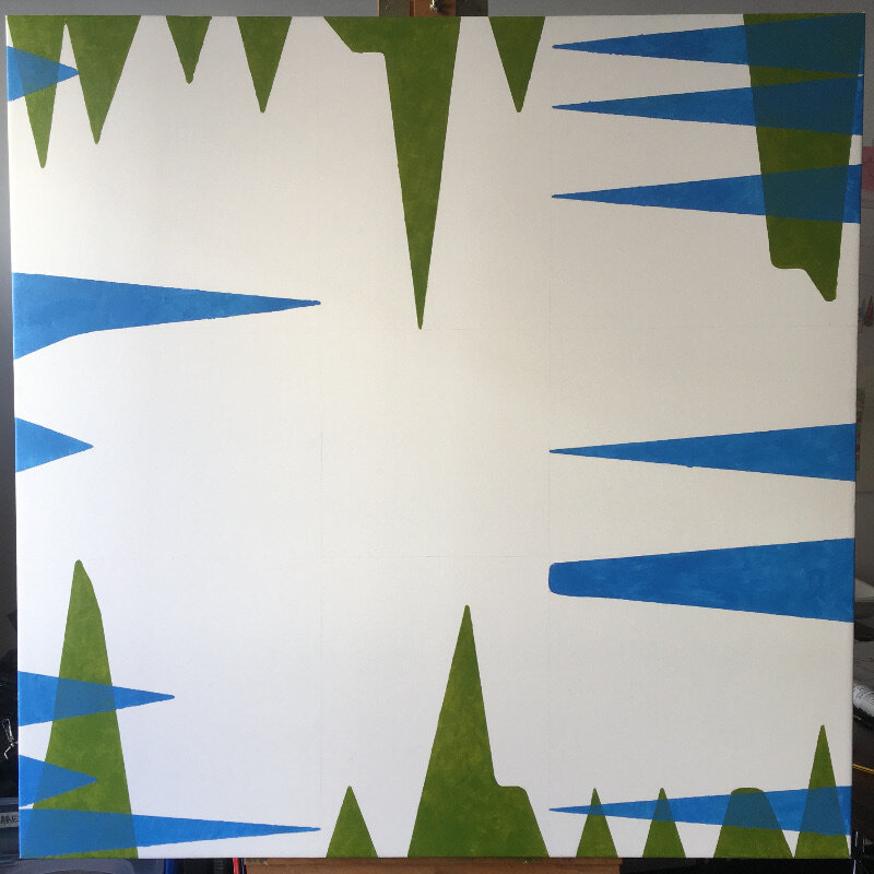
It seemed a shame to ruin it really, this satisfyingly square first attempt at a canvas. Last week’s fear over what to do next turned into what I can only describe as a modernistic inertia, as it sat in the studio waiting to be defiled. I had built it up too much; that first gestural mark felt like it had to encapsulate everything that I’ve written about so far: the internet, attention culture, the old theatre crowd, colour theory and the death of interest. All things considered, this reluctance is the down side of having a clear concept in mind, there could never be anything spontaneous or automatic about this work, otherwise it would be a stab in the back- if only with a paintbrush. Yet, working to a plan gives a visual idea some semblance of intention and meaning, especially when something as flippant as colour comes crashing into the room; such a thing can throw you completely. A plan honours the original idea; if something stuck out in your mind as being better than something else in the beginning, then why not try to stay as close to that moment as possible?
I have said many times before that my work comes from the concept, a contextual version of base camp if you will. The best route, potential hazards and the appropriate equipment all depend on what’s decided over bacon and eggs- how do we get to the top without dying or losing sight of why we’re even here? They say each mountain climb is different and that goes for making art too but to continue this ‘lofty’ analogy would give you altitude sickness sooner or later so let’s get to the point- the interesting thing about “Bums on Seats” (working title) is that it carries on from “First Past the Post” and “Straight from the horse’s ass” in the sense that they are all rigorously planned, painted abstractions that represent a system. I say interesting because producing three examples of similar work in close succession is strange for me- I should be bored with it by now.
Onto the painting itself- I have started out with the data that relates to January and February. The composition relies on each edge of the canvas serving as the original x axis and the centre as the void that the subjects try to reach into. I’m looking for some balance within the painting so the matching colour spikes (relating to page views, visitors etc) will mirror each other from opposite sides. After conducting some experiments recently I am choosing colours that worked, or at least complimented or blended into each other to form a range of darker tones. As the layers become more complex I hope to see some colours either dominate or fade at first glance (in the same way that visitor hits from earlier this year barely seem relevant to what’s happening now, even if was an impressive statistic at the time).
My knowledge of oil paint is sketchy at best so this piece is being made with gloss medium and acrylics. Using the former would be like going up K2 without any decent boots…


